
At-Bay Refresh
At-Bay combines cyber insurance and managed security into a single offering they call InsurSec, a category they helped define. After significant product growth, their web presence needed to catch up. Over months, I redesigned key landing pages and built a CMS component library to support the launch of Stance MDR's updated platform and At-Bay's new Nexus insurance packages.
The Design Opportunity
The core problem wasn't aesthetic, it was conceptual. At-Bay is a cybersecurity company and an insurance provider simultaneously, and most brokers and business owners have never encountered that combination. The design needed to make an unfamiliar idea feel obvious, fast, without flattening what makes it genuinely different.
Every page also had real business work to do: launch new products, explain new pricing tiers, and move brokers toward booking a demo. That meant balancing education with momentum at every step.
The CMS component library added a longer horizon to the work, not just what launched, but what the marketing team could build independently afterward.
Deliverables
New Brand Visuals,
New Landing Pages,
New CMS Modules,
The Team
Andrea Novo, Sr. Brand Designer / Design Lead
Erin Dolan, Senior Digital + Growth Marketing Lead
Michael Lowe, Head of Marketing
Before the Redesign
The existing site had good bones but hadn't kept pace with the product. The visual language felt dated, the product was largely hidden from view, and the page structure couldn't support what At-Bay needed to launch. I broke the refresh into three phases to manage scope, test direction early, and build momentum.
PHASE 01
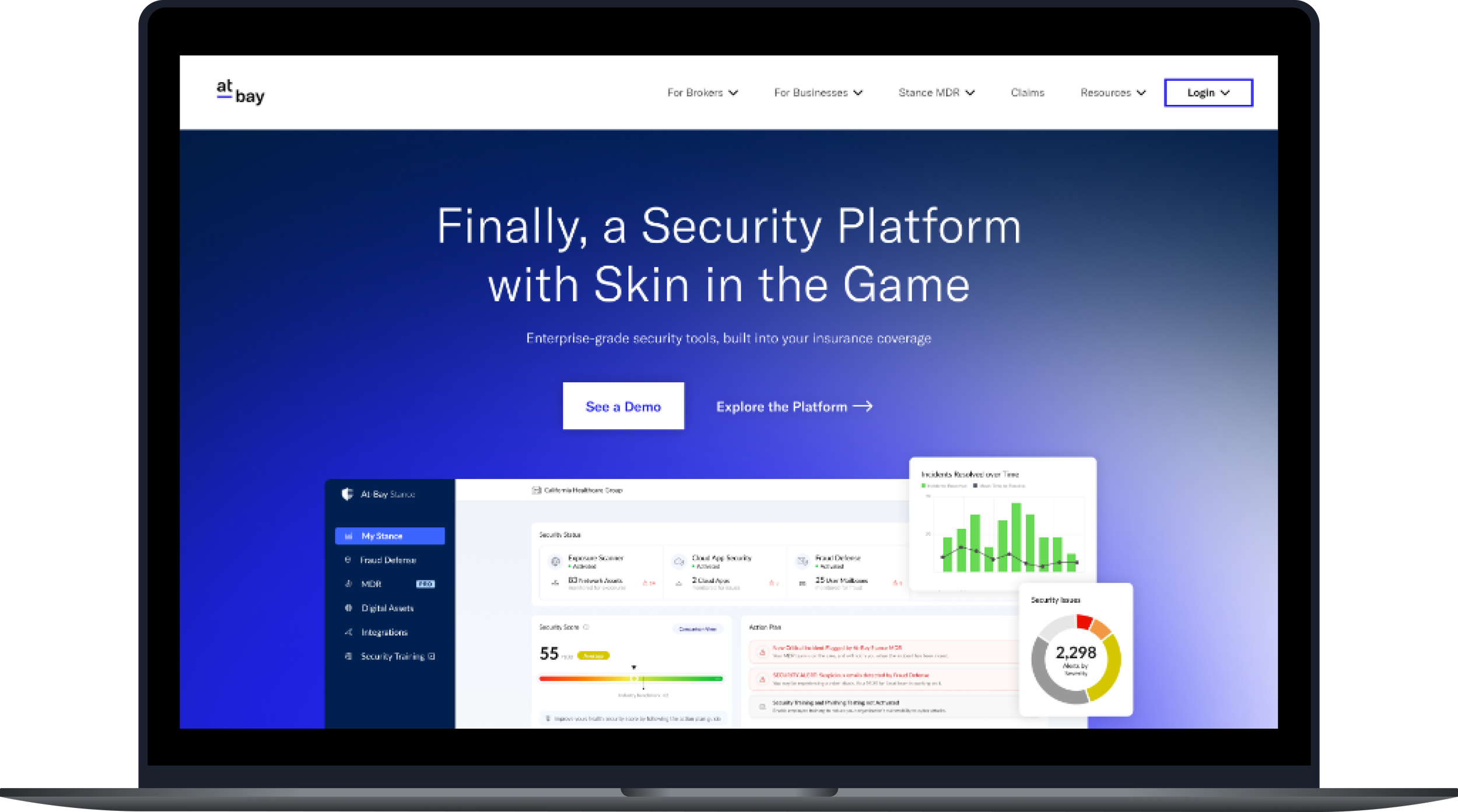
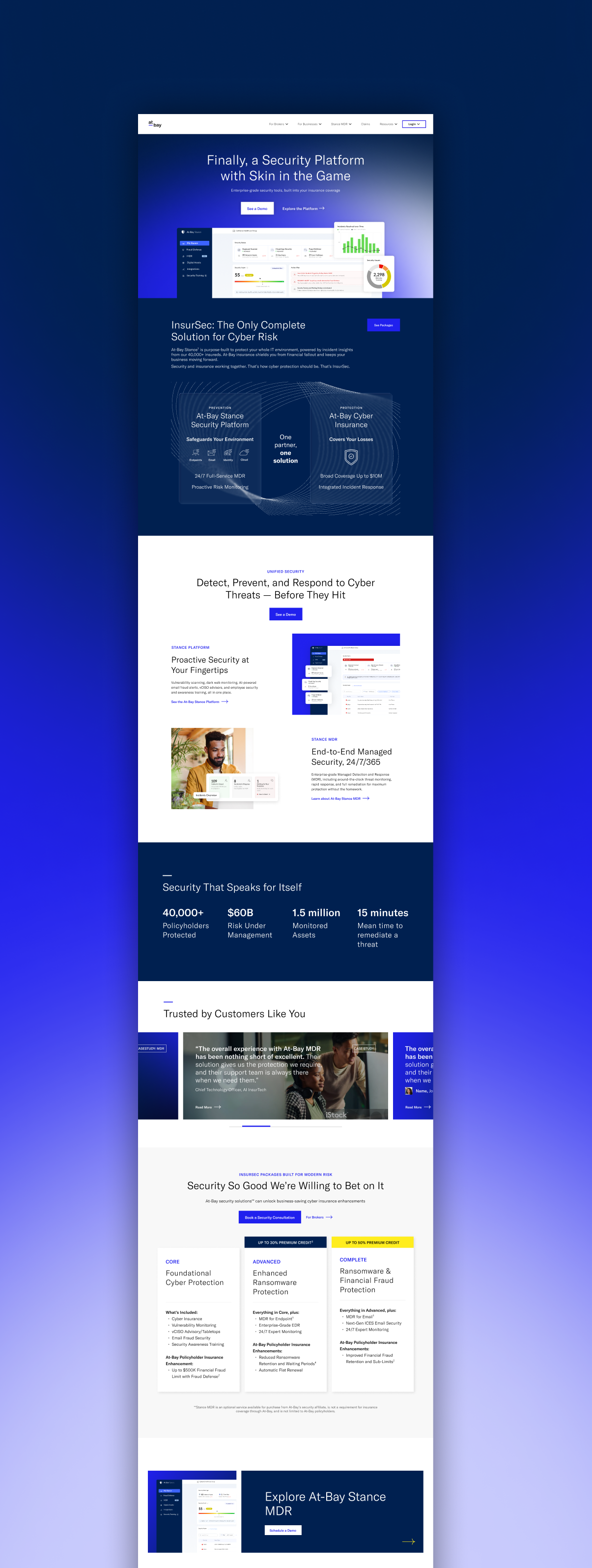
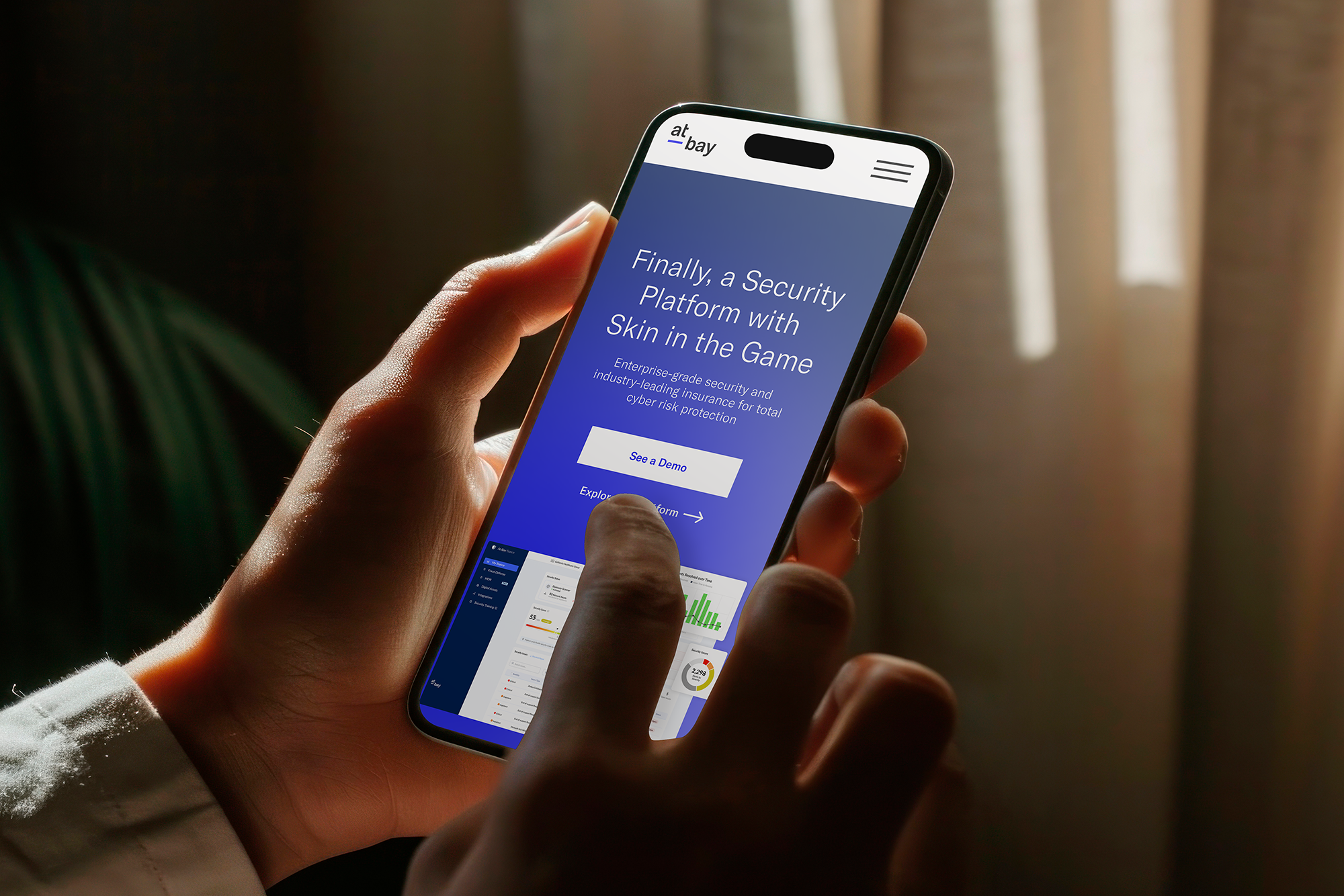
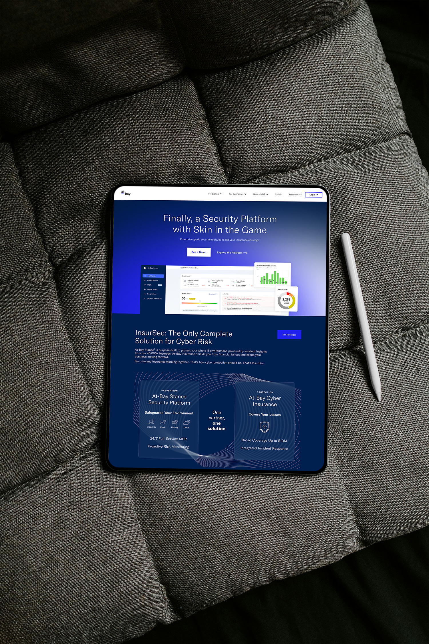
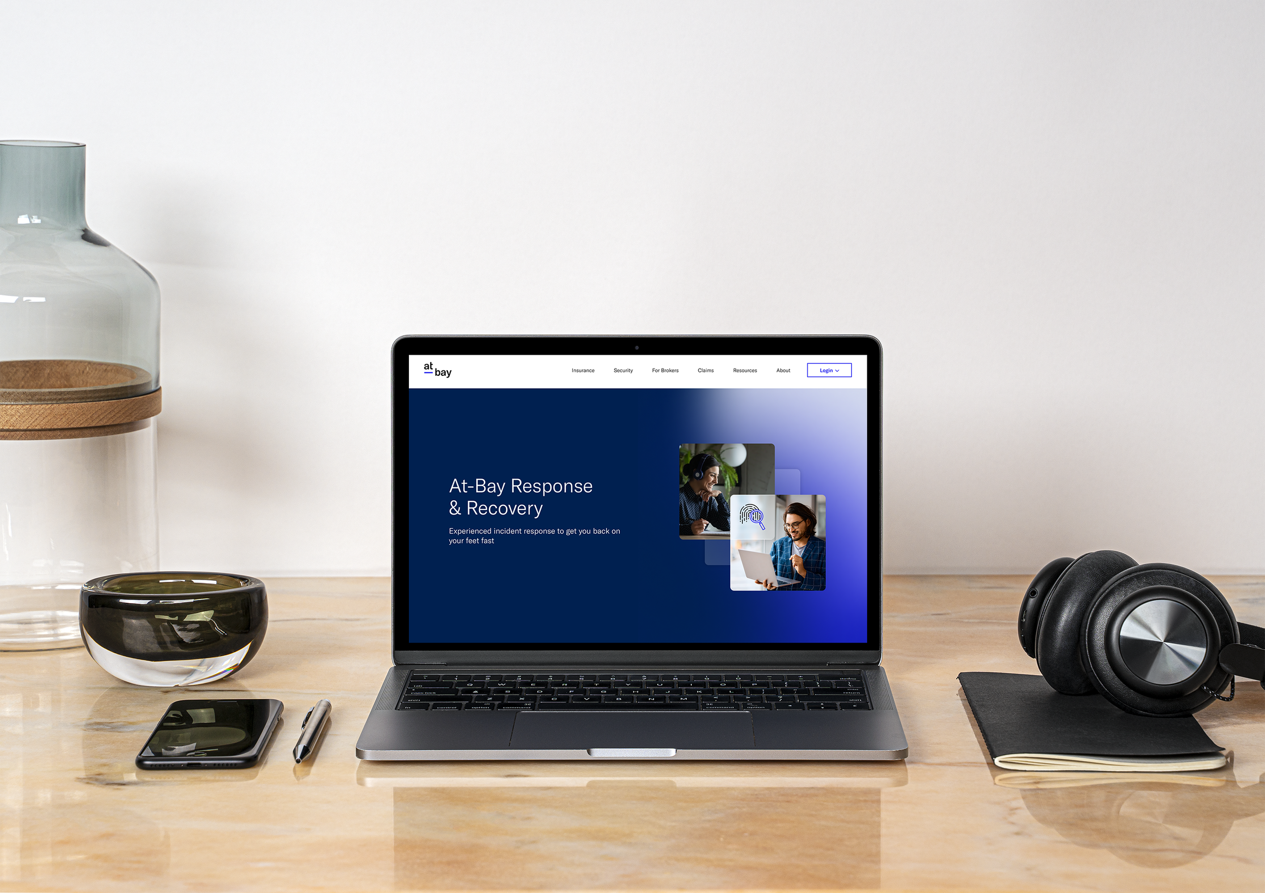
Home
The home page set the tone for everything, establishing the refreshed visual language, introducing the InsurSec story, and laying the foundation for the component system. Getting it right early gave the subsequent phases a clear reference point.
PHASE 02
Security & Stance MDR
With visual direction locked, focus shifted to the security offering, introducing Stance MDR's expanded capabilities, surfacing the product UI for the first time, and giving brokers and security buyers the detail they needed to evaluate it.
PHASE 03
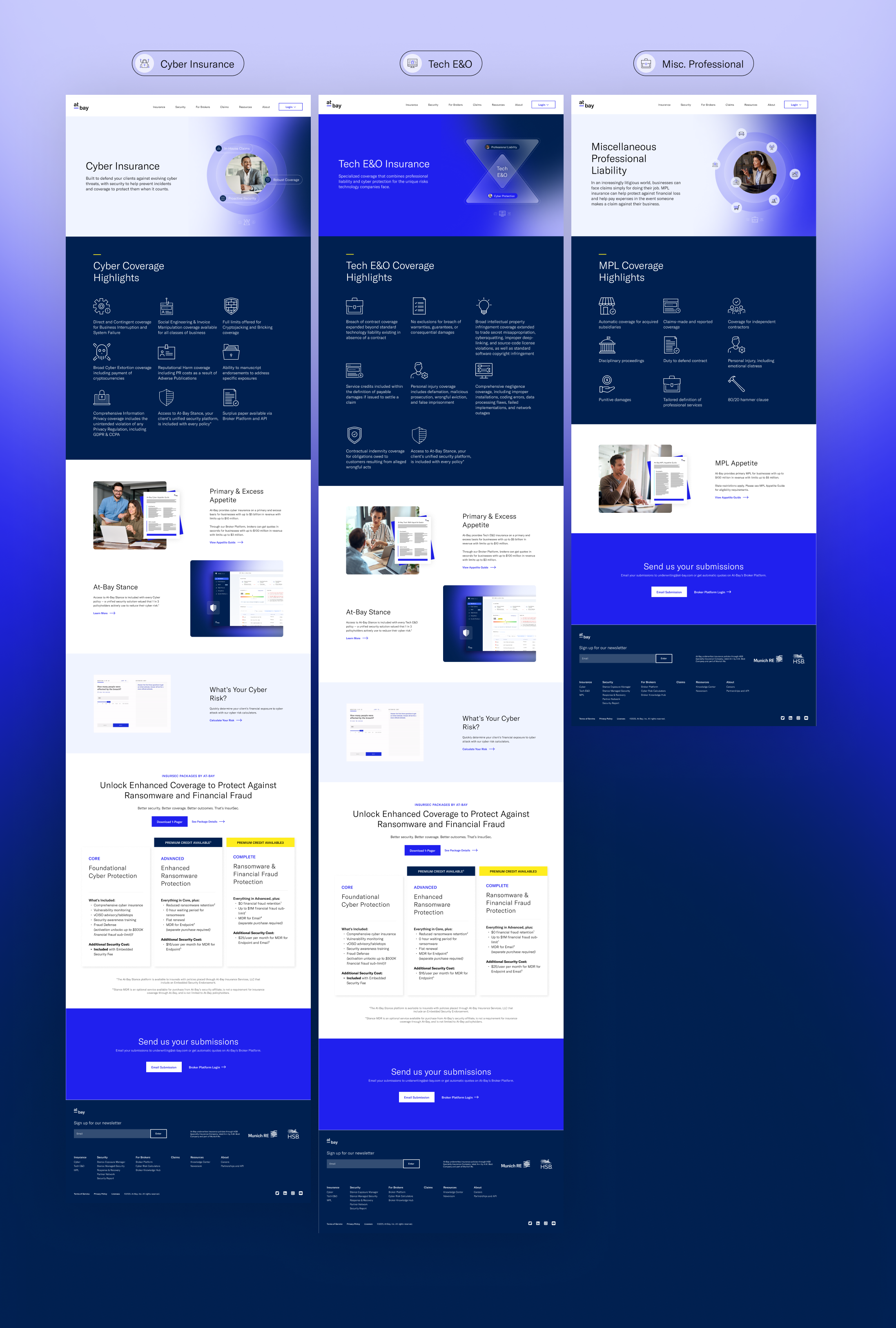
Insurance & Broker Resources
The final phase covered the insurance side and the broker resources hub, connecting the security narrative back to the insurance value prop and making it easy for brokers to compare packages and move forward.
The Project Goals
This wasn't a routine redesign, it was a communication challenge. How do you make a complex, dual-sided business model immediately legible to brokers, security teams, and small business owners who need to trust it quickly?
The work had to operate on multiple levels: educate new audiences on InsurSec, re-engage broker partners, and launch new product lines under a more confident, cohesive brand.
Increase broker engagement
At-Bay's data shows 50%+ of cyber claims could have been avoided with MDR in place. Brokers needed that number front and center.
Expand the CMS component library
New reusable modules gave the marketing team tools to build campaigns independently, without starting from scratch each time.
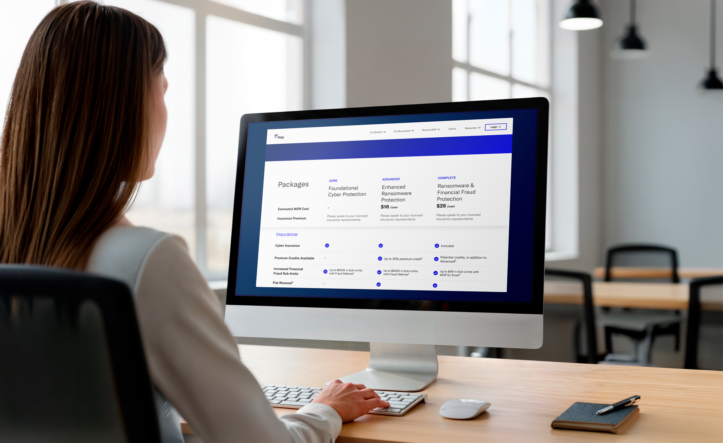
Launch Nexus Quotes & Packages
A new tiered structure (Core, Advanced, Complete) with differentiated coverage including zero retention on ransomware. The pages needed to make comparison feel effortless.
Refresh brand visuals
Evolve the visual language to reflect At-Bay's market maturity and position as a category leader.
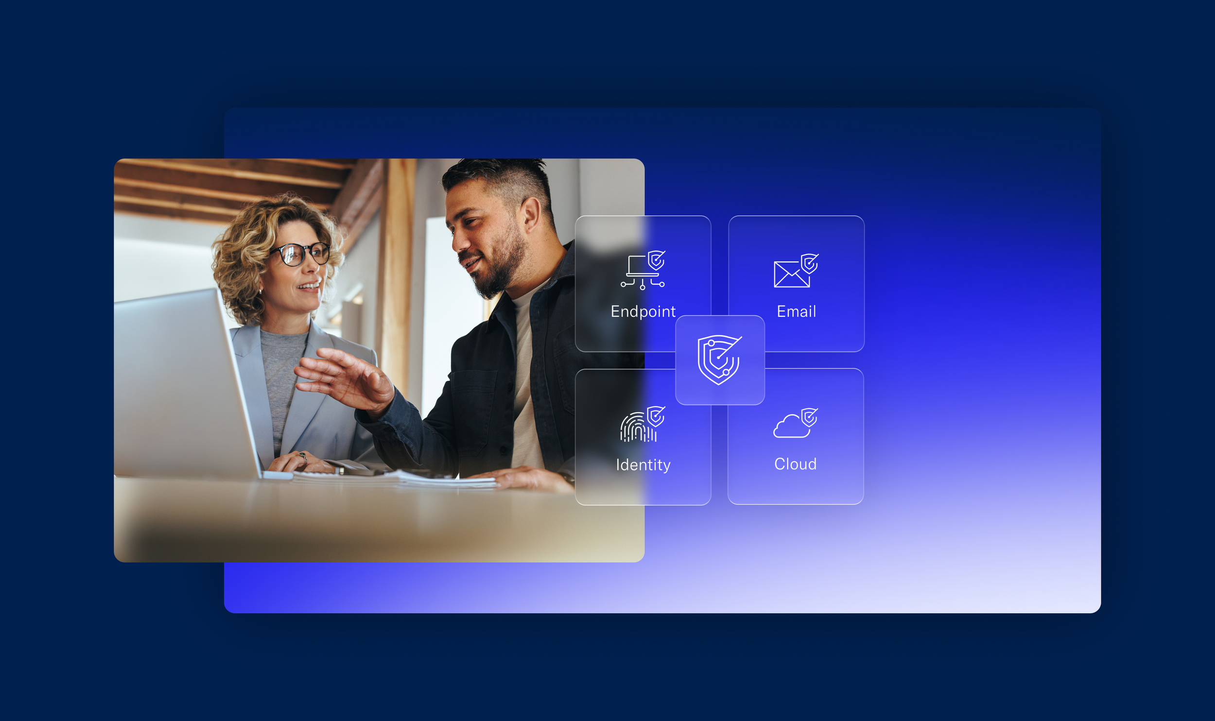
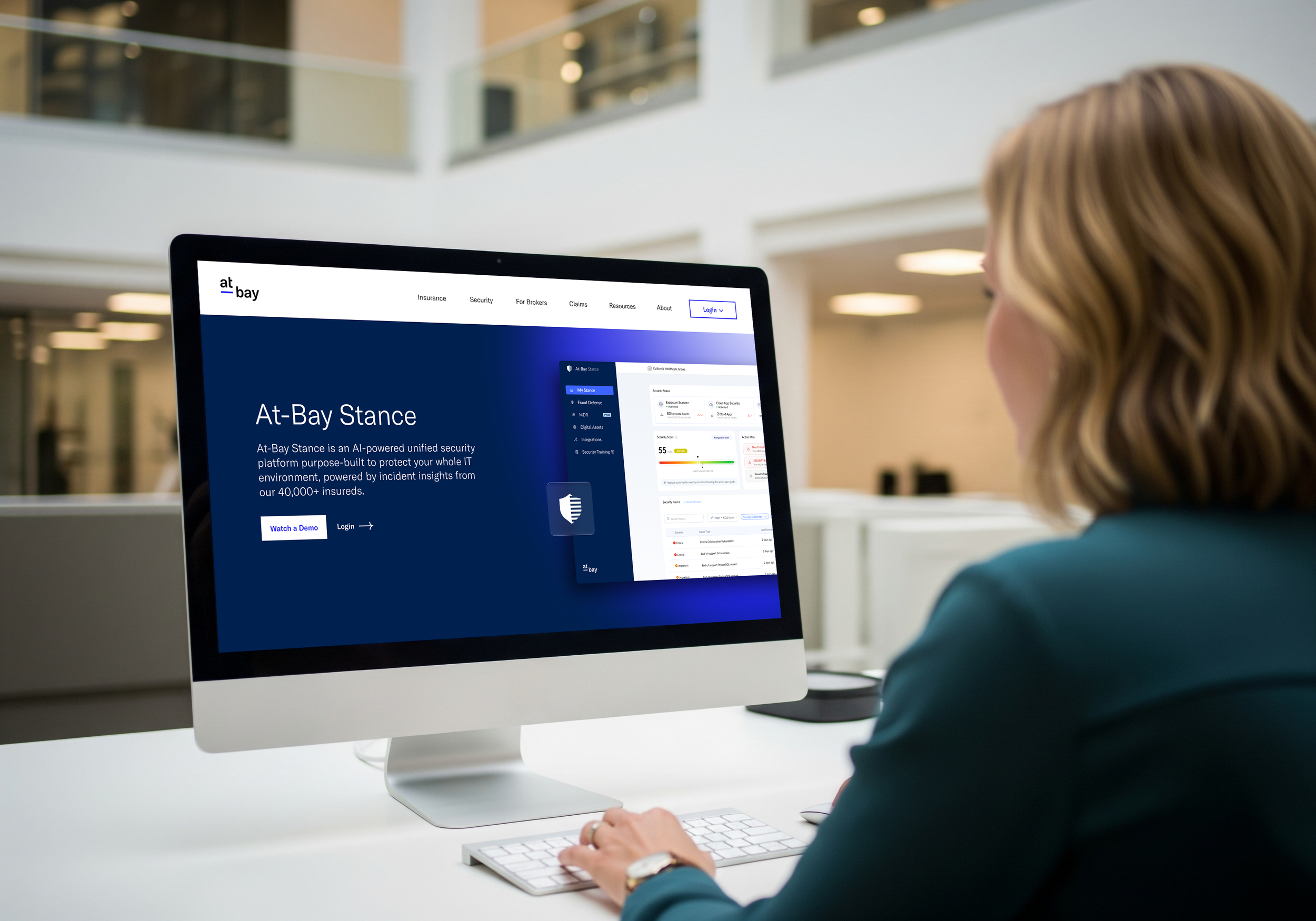
Reintroduce Stance MDR
The product had grown up. It now covers endpoint, email, identity, and cloud under a full MXDR model, with a 24/7 SOC and a mean time to contain threats of under 15 minutes. The site needed to show that clearly
Clarify the InsurSec model
Most visitors had never encountered a company that does both security and insurance together. A big part of the design job was making that concept click quickly, without losing people
Research & Discovery
Before opening Figma, I mapped the audiences. Brokers, security buyers, and small business owners each come with different levels of familiarity with cyber risk and different reasons to care. A competitive analysis of how others in insurance and security tell their stories online revealed a consistent gap: most were either too technical or too fear-driven. There was a clear opening for something credible and human.
Refreshed Visual Elements
Rather than starting from scratch, the goal was to push At-Bay's existing brand into a more mature, dynamic and educational direction. The refreshed visual system needed to feel at home in both the security world and the insurance world, which meant finding a balance between technical credibility and approachability. Changes were intentional and considered, not a wholesale rebrand.
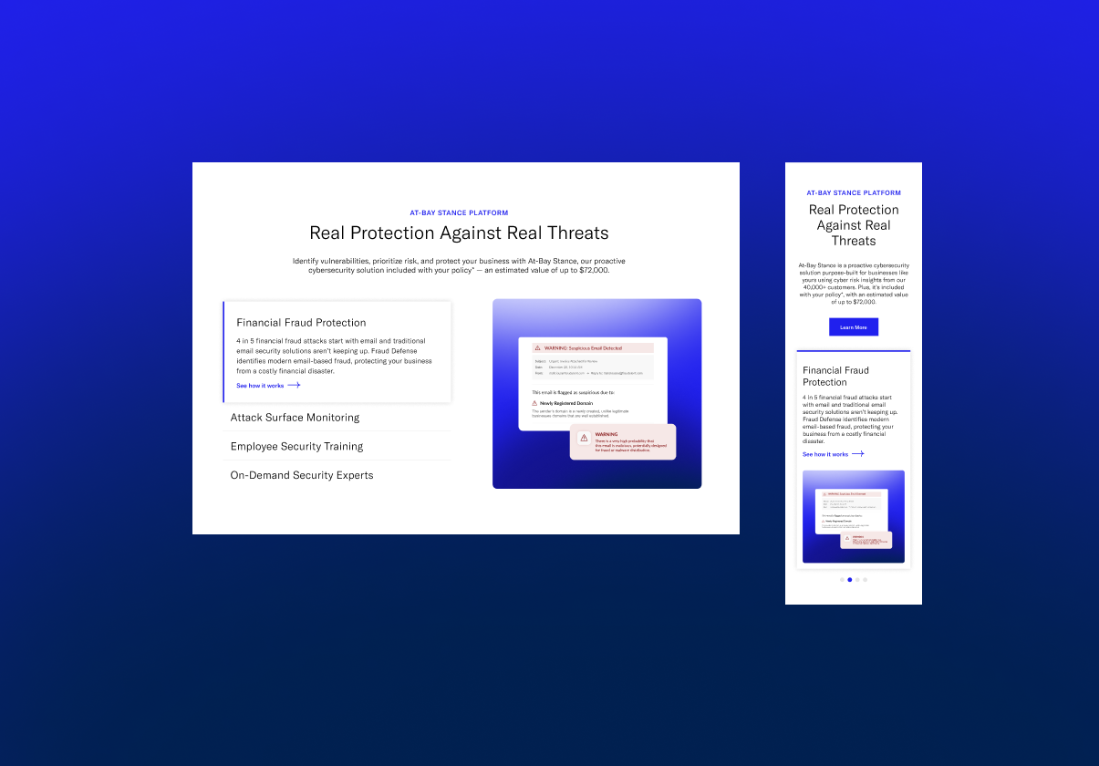
Product Illustration
The previous pages had a fundamental problem: the product was invisible. Visitors had no way to see what they were actually buying. I made the Stance platform a visual centerpiece, surfacing the threat detection dashboard, vulnerability prioritization views, email fraud protection, and MDR coverage across endpoint, email, identity, and cloud. Giving the UI page presence made the promise of 24/7 protection feel real and verifiable.
Streamlined Infographics & Data Visualizations
At-Bay has genuinely compelling data, the kind that shifts how a broker thinks. The goal was to get those numbers out of body copy and into the visual hierarchy, where they could do actual persuasive work. Infographics made the case for InsurSec without requiring someone to read their way to it.
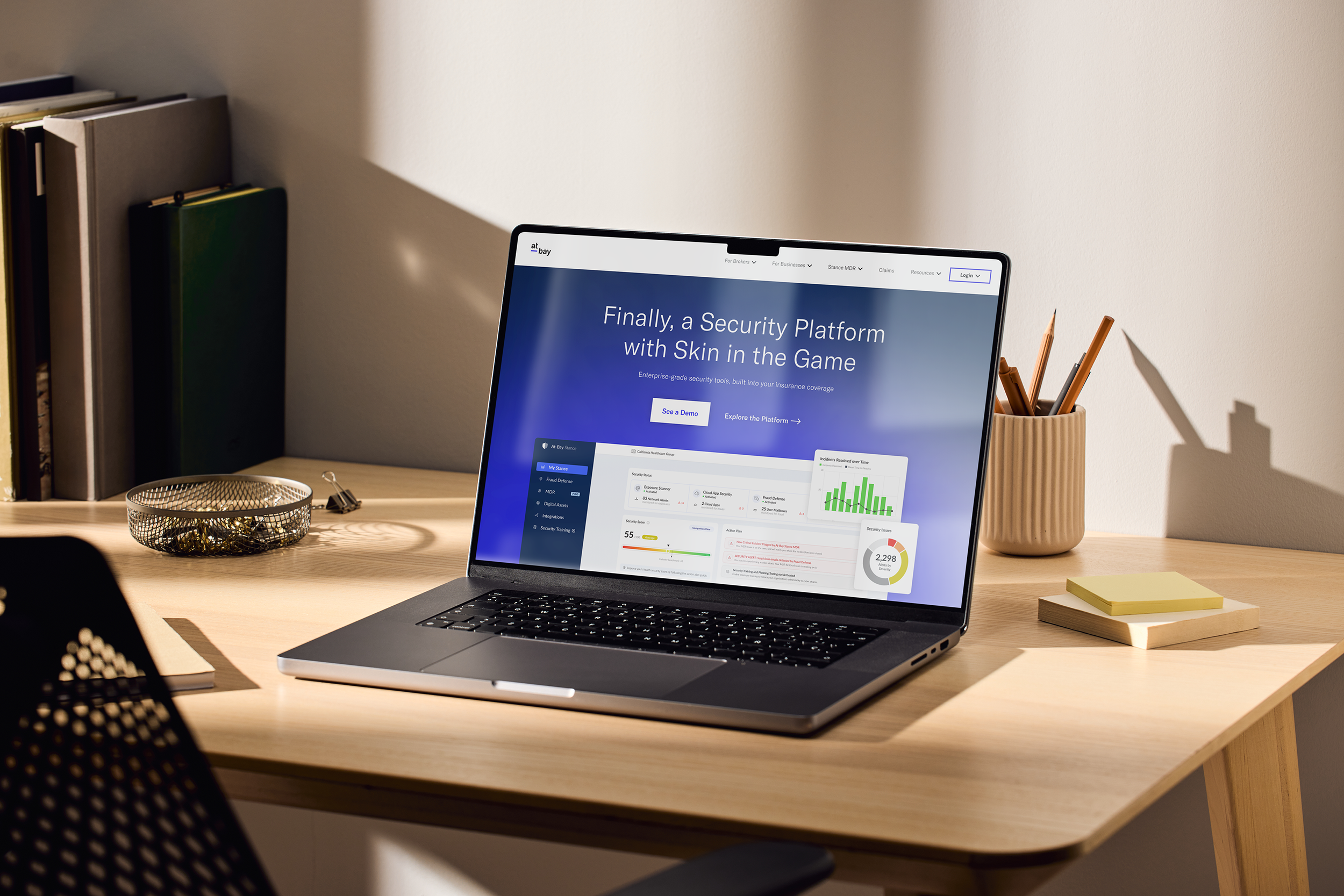
Photographic Style
Rather than the cold, abstract imagery typical of the security industry, the photography direction centered real people running real businesses, the small business owners and teams At-Bay actually serves. It kept the brand grounded even when the surrounding content was technically dense.


New Gradients, Rounded Corners + Abstract Glass Elements
New gradients and glass-effect treatments brought warmth and depth to what could easily feel like cold enterprise software. The abstract quality of the glass elements also did conceptual work, evoking the layered, always-on nature of the security coverage itself.
Final Designs
Phase o1
Home
Security & Stance MDR
Phase 02
At-Bay Stance
Fraud Defense
Managed Detection + Response
Phase 03
Insurance & Broker Resources
Broker Resource Hub
Insurance Pages
New & Updated CMS Modules
The component library was built for real-world use. Every module needed to flex across campaigns without breaking the design system, something the marketing team could own independently from day one, not just something that held together under ideal conditions.
Nexus Quote Packages
Pricing Table
Testimonial Carousel
Information Accordion