The Uncommitted Customer
Report
The core challenge wasn't making something look polished. It was making complexity feel inevitable.
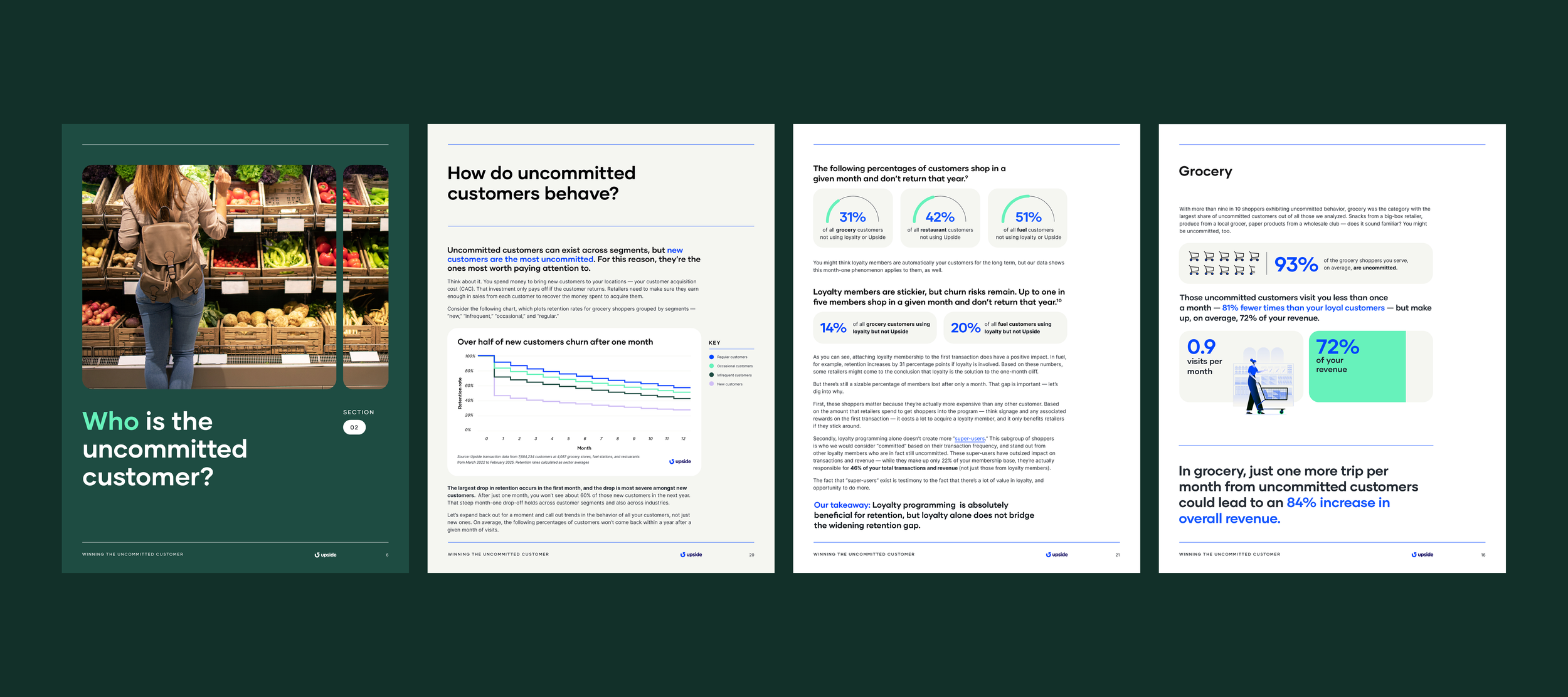
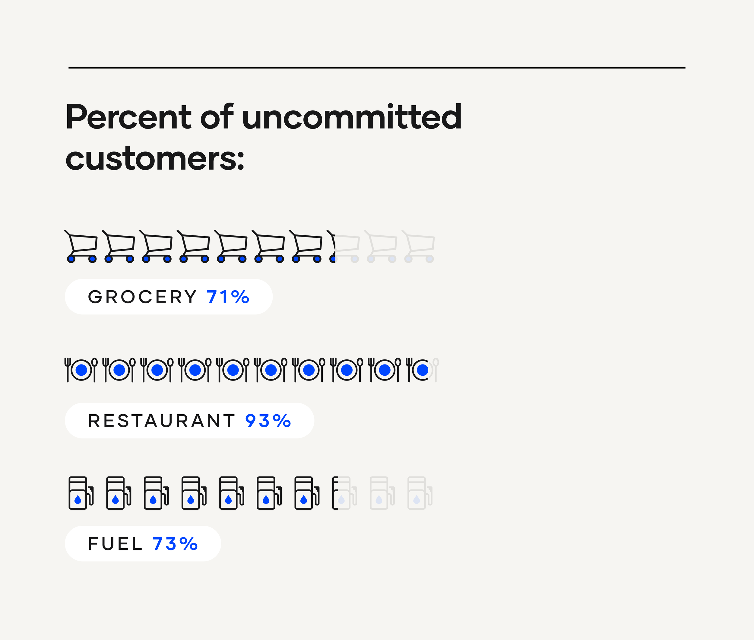
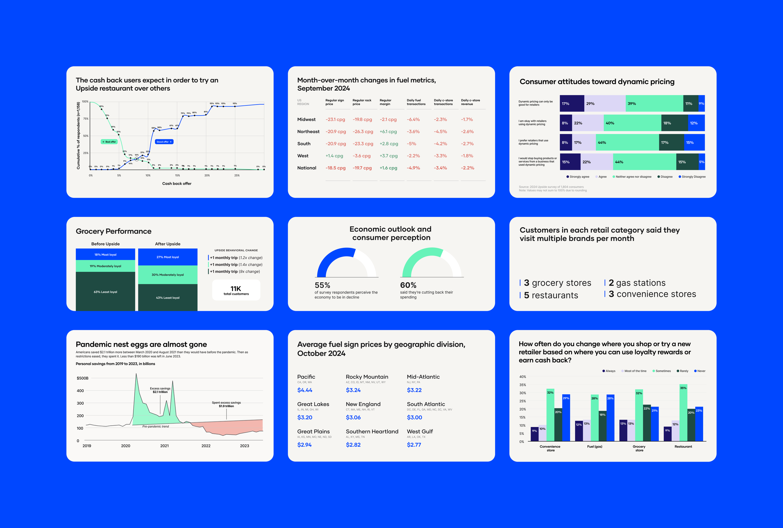
The report presents a layered argument: nearly 80% of retail customers are uncommitted, they're concentrated in the highest-churn segment of any business, and the financial upside of winning just one more visit per month is transformational, up to a 209% revenue increase depending on the category. That's a compelling story. But it lives inside survival analyses, scatter plots, retention curves, and cross-category comparisons that could easily become walls of data.
The design had to do the interpretive work, guiding the reader through the argument so the numbers landed with the weight they deserved, not got lost in them.
The Deliverables
Report Layout & Design System
Data Visualizations & Infographics
Print / PDF Production
The Team
Andrea Novo, Contract Designer
Upside Research & Marketing Team
Refreshed Visual Elements
Layout System
Before designing a single page, I established a component-level system: typographic hierarchy, a color architecture rooted in Upside's existing brand, and reusable callout, stat, and chart container patterns. With 32 pages of tightly interwoven data, consistency wasn't just aesthetic, it was functional. The dark forest green chapter breaks give the reader a clear sense of progression through four distinct arguments: who the uncommitted customer is, where they show up, how they behave, and how to win them.
Photograph & Clean Visuals
The photography keeps the report grounded. Real people at grocery stores, gas pumps, and restaurant checkouts, not abstract stock imagery. Paired with clean white content pages and data-forward layouts, it sits in the space between academic paper and marketing brochure: credible, readable, and designed for a decision-maker's desk.
Making the data do the arguing
Upside's research is rigorous, built on survival curves, Cox regression, and transaction analysis across 75 million data points. The design job was to strip everything back to the insight and let the visual treatment make the case. Large-format stat callouts function as standalone claims, a reader skimming should feel the argument without reading surrounding copy. Individual charts follow the same logic: dense enough to show genuine distribution, clean enough to hold the point. Where a chart wasn't needed, it was cut entirely.